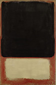
 Tragedy, Ecstasy, Doom: The Art of Mark Rothko 'I hate and distrust all art historians, experts and critics. They are a bunch of parasites, feeding on the body of art. Their work is not only useless, it is misleading. A painting doesn't need anybody to explain what it's about. If it's any good, it speaks for itself, and a critic who tries to add to that statement is presumptuous.' (Mark Rothko cited in John Fischer, 'The Easy Chair: Mark Rothko, Portrait of the Artist as an Angry Man', 1970 reproduced in M Lopez-Ramiro (ed.) Mark Rothko: Writings on Art, New Haven 2005, p. 133) Like many pioneering abstract artists of the 20th century, Mark Rothko was fearful of the apparent simplicity of his art. He was concerned that its non-objectivity could be misunderstood as vacancy or emptiness and that the rich sombre tones of his colour and the sober dialogue between his forms might be dismissed as mere decorative colourism. As a result, he was scornful of most commentary on his work and, in his own writings and statements about his painting, often tended to overcompensate for this simplicity by stressing the psychological complexity and ancient mythical intensity brought to, and invoked by, his work. According to him, his paintings were epic 'dramas' involved with the entire 'scale of human feeling', sober monuments expressive of 'tragedy, ecstasy and doom'. Rooted in his own strongly psychological reading habits and in the deep sense of redemption that he and his generation wanted to give to the world in the aftermath of the Second World War, Rothko wanted to create an art that invoked a universal and timeless language - one that spoke directly to and about a collective humanity - in a new age of existential uncertainty. In this respect it is perhaps only Rothko's works, of all the paintings of the New York School, that really succeed. For, more than the paintings of Pollock, Newman or de Kooning for instance, it is Rothko's works that are most often understood and appreciated by people with little or no experience of art. While for Rothko himself, his paintings were expressive of the ancient plays of Aeschylus and Sophocles, the music of Mozart (to whom he listened while he painted) the tragedies of Shakespeare and the philosophical landscape of Nietzsche's Birth of Tragedy, their 'real genius' as the painter Robert Motherwell pointed out, was that they expressed and articulated a universal 'language of feeling' using only colour. Inspired by the example of Matisse, from whom, being a European artist, Rothko was always very keen to distinguish himself, the Russian born painter 'heroified' colour, making it the sole protagonist of his abstract 'dramas'. Declaring that 'the familiar identity of things has to be pulverized in order to destroy the finite associations with which our society increasingly enshrouds every aspect of our environment', Rothko found a way to create an art of deep spiritual intensity by asserting colour as its own entity. By abandoning all objects and every element or thing that could distract, divert or get in the way of the viewer's meditative experience of his paintings, Rothko established colour as a real physical presence. Filling the visual space of the viewer with a radiant energy born from the artist's careful brushwork and the feathered edges of his rectangular coloured fields, Rothko's powerful horizontals define themselves against the vertical living presence of the viewer. His horizon-like bands and fields of colour envelop the viewer's frame of vision and, in doing so, appear to permeate through the body, seemingly bypassing vision, to prompt an emotional response that is both immediate and undeniable. It is in this way that Rothko paintings seem to be felt rather than seen and the somewhat surprising effect of this can sometimes be overwhelming. In the early 1950s Rothko first made his great breakthrough to this way of painting and first established this Dionysian/Apollonian dialogue of grid-like coloured rectangles. 'This kind of design may look simple,' he said, 'but it usually takes me many hours to get the proportions and colours just right. Everything has to lock together. I guess I am pretty much a plumber at heart'. As works like No 7. (Dark over Light) of 1954 and Untitled (Red, Blue Orange) of 1955 illustrate, the success and power of these works relies on the deep romanticism implicit within Rothko's painting. 'The poignancy of art in my life (lies) in its Dionysian content... nobility, ...largeness and exaltation are hollow pillars, not to be trusted, unless they have as their core, unless they are filled to the point of bulging, by the wild', he said. Rothko's art is ultimately one of transcendence, and it is the mysterious power of the sublime, like the hypnotic power of a sunset, to mesmerize and transfix a viewer that it harnesses. Born in 1903 in Dvinsk, Russia, Rothko lived in Portland, Oregon from the age of seven before moving permanently to New York in 1921.As the artist Sean Scully has pointed out, Rothko's paintings invoke a very similar sense of the sublime to that established by the Romantic landscape tradition. Rothko 'came from the West Coast where it's a very misty and mountainous terrain - perfect terrain for producing Romantics,' Scully observed. 'When he came to Manhattan, all this hits the New York grid and then you get this, you get Rothko, and it's the two put together that brings this yearning for the sublime into correspondence with urban architecture, and you get this new appearance, a new look.' The strong combination of landscape, vista, and the yearning for the sublime evident in his mature work reached its apogee in Rothko's last great series of grey paintings made shortly before the artist's suicide in 1970. Contrary to the myth that grew up around these often bleak paintings in the years after his death, this last duotone series reflects less a dying of the light and a weakening of the will than a strengthening of Rothko's determination and a courageous resolve to look his encroaching mortality in the face. Powerful and stark manifestations of the sublime, it is in this respect that paintings such as Untitled (Black and Gray) of 1969 can be seen as the artist's final triumph - the painterly culmination of what had been a life-long mystical search for a universal art of transcendence. An art expressive of what Rothko saw as the core fundamentals of life: tragedy, ecstasy and doom. Robert Brown is international head of Research, Modern, Post-War & Contemporary Art, London |
|